This was the first contemporary ‘pocket neighborhood’ that set the stage for all the others that followed. It demonstrated that eight smaller cottages have less impact than four large homes on the same site. It also confirmed there is a market for cottages designed for one and two-person households in a community-oriented setting.
It was the result of involvement of people on every level who paved the way: a forward-thinking state government, a pro-active planning director, an innovative architect, a sensitive developer, an enlightened banker, and a supportive community.
Innovative Zoning
Facing the same growth pressure as many towns across America, the City of Langley, WA (pop. 1100) adopted an innovative “Cottage Housing Development” (CHD) zoning code provision to preserve housing diversity, affordability and character, and to discourage the spread of placeless sprawl. It allows for up to double the density of detached homes in all single-family zones — providing the ground floor area is less than 700 SF and total area including the second floor is less than 975 SF. The cottages must also face a usable landscaped commons, and have parking screened from the street. To ensure good fit within existing neighborhoods, each project proposed is reviewed by the planning and design review boards.
Summary
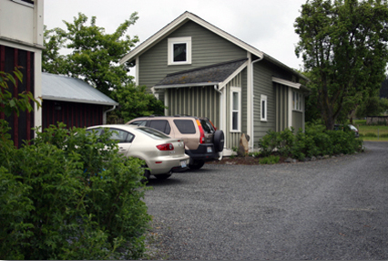
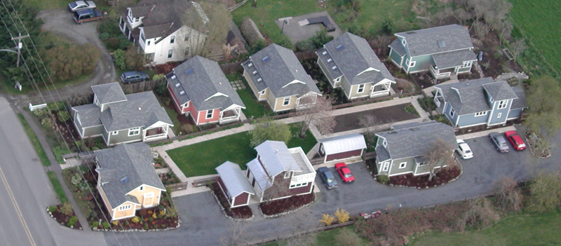
The Third Street Cottages was the first to utilize this innovative code. The community of eight detached cottages is located on four standard single-family lots (31,000 SF total area). The homes are approximately 650 SF, with lofts up to 200 SF, and are conveyed as condominium ownership. They are situated around a shared garden with a Commons Building and Toolshed. Parking is detached and open and every residence has a storage room.
Essential Design Keys
With this first project, we were utterly clear with our intention: provide well-defined personal space and foster a strong sense of community. Here are the key elements we used to accomplish our goal:
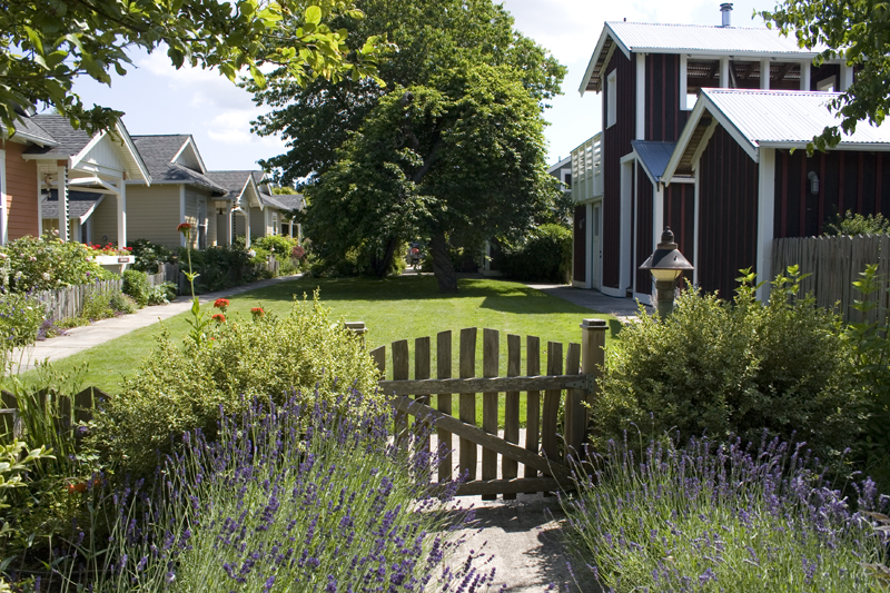
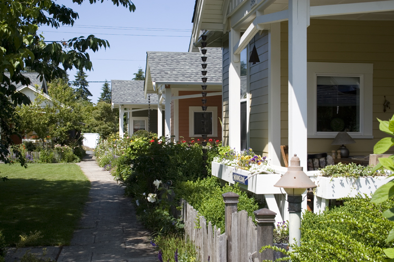
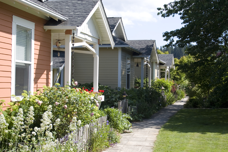
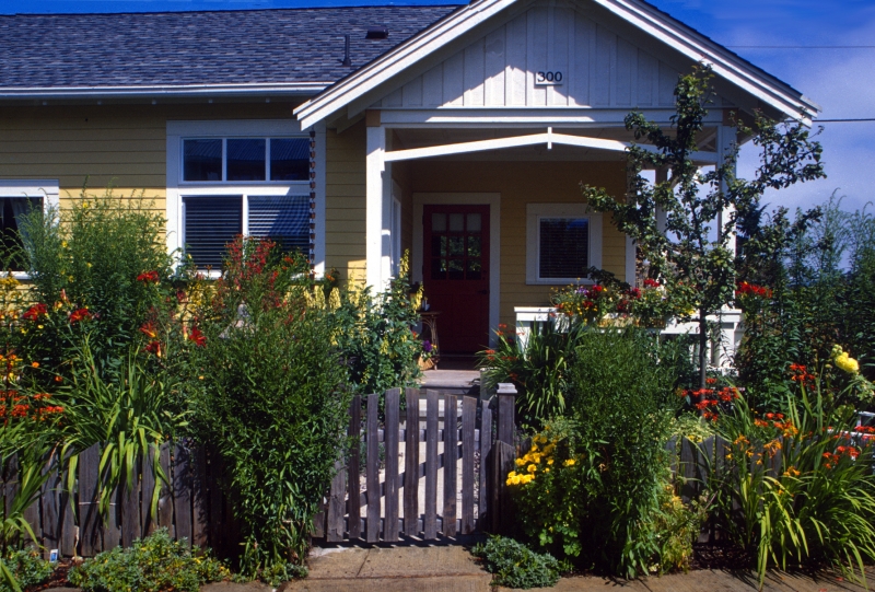
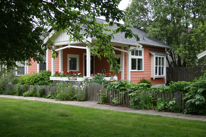
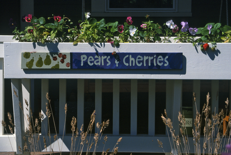
Layering from Public to Private. It is essential to clearly define personal boundaries. A resident arriving home or a guest coming to visit enters through “implied” gates — near the mailbox kiosk or the parking pockets — into the semi-public Commons. This shared garden is edged with a perennial border and a low split-cedar fence*. A swinging gate opens to the private yard, and a walk leads to steps, the front porch and front door. The porch railing* is at a height just right for ‘perching’ and is adorned with flower boxes to further define (and express) a personal boundary. Within the cottages, the layering continues with active spaces in front and private spaces in back and above.
*We’ve often found these elements missing when other developers work with the cottage courtyard pattern. The reason it’s so important is that the low hedge, fence and porch railing define personal territory. Without them, the resident can feel exposed and less inclined to venture out.
Nested Houses. To ensure privacy between cottages, the houses ‘nest’ together: the ‘open’ side of one house faces the ‘closed’ side of the next. You could say the houses are spooning! The open side has large windows facing its side yard (which extends to the face of neighboring house), while the closed side has high windows and skylights. The result is that neighbors do not peer into one another’s world.
Eyes on the Commons. The first line of defense for personal security is a strong network of neighbors who know and care for one another. When the active spaces of the houses look onto the shared common areas, a stranger is noticed. As well, nearby neighbors can see if daily patterns are askew next door or be called upon in an emergency.
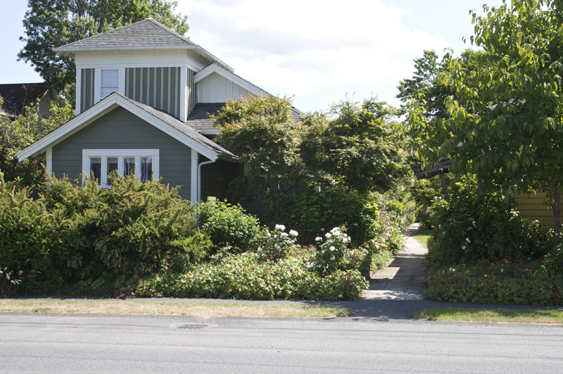
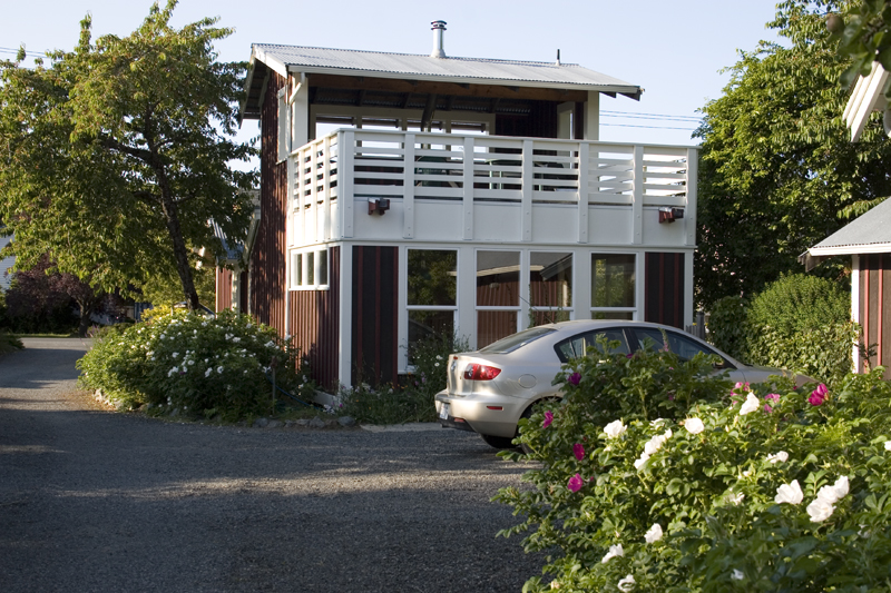
Corralling the Car. Cars dominate our lives to a great degree, so its critical they are kept in check. We’ve intentionally placed parking away from the cottages and screened from the street, having residents walk through the Commons to their front doors. This arrangement creates an opportunity to smell the flowers or talk with a neighbor in the flow of daily life. While considered controversial by some, it has not proven to be a hardship.
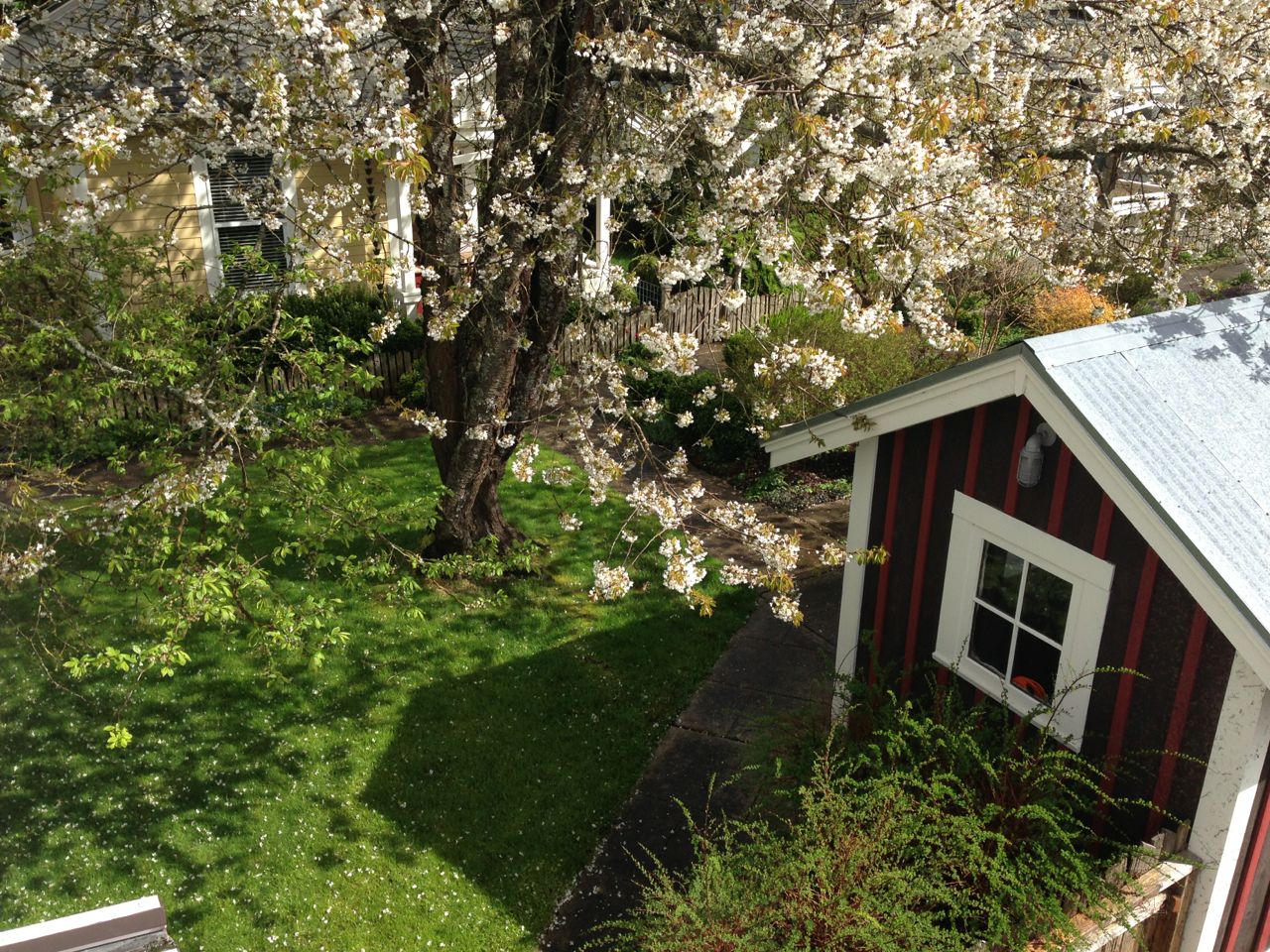
The Commons. With all paths leading through and all cottages facing the Commons, this is the locus of community. A pea-patch garden is on one end, a calm stretch of lawn is on the other, while a child’s swing hangs from the heirloom plum tree at the center. To the side is the Workshop: the place to cane a chair, start spring seedlings, and gather for parties. On the roof is a terrace with a terrific overview. The Tool Shed provides a spot for shared garden tools.
Mailbox Cluster. Rather than picking up mail from your car, boxes are clustered in a kiosk and the pedestrian entrance, increasing ‘chance’ meetings among neighbors.
Cottage Scale. These are 1-1/2 -story cottages, not 2-story houses. The difference is not just about style, but impact on the surrounding neighborhood. If twice the density of houses are allowed in a single-family zone, they need to be cottage scale.
Individuality. Each cottage, though similar, is unique. This fosters a personal bond of caring and identity with each householder and their home. We carefully chose exterior colors for each cottage in relation to one another – a total of 24 different colors! While this was a bit over the top, we feel it is important to clearly differentiate one cottage from another. Each household creates their own garden landscape and flowerbox garden. Some are like overgrown English Cottage Gardens, while others are simple and Zen-like. But they all seem to work together. Another way the cottages are each unique is because homeowners name their own cottage. When a house has a name, how can it be a commodity?
Porch Rooms. So many porches these days are ‘faux porches’; they may look like a porch, but have absolutely no function except to provide “modulation of the façade” and “curb appeal.” That’s just babble. A porch should be large enough to be a room and placed just off of the active area of the house. It should also be next to the commons, where householders can choose to informally engage with neighbors. The passageway to the front door should pass along the side and not the center of the porch to preserve its function as a room.
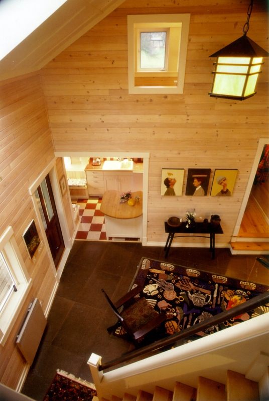
Living Large in a Small House. A small house can feel and function large when there is ample light and adequate storage space. Nine-foot and higher ceilings with large windows and skylights fill the rooms with light, creating a much larger perceived sense of space. There is ample storage with walk-in closets, built-in shelves and an attic. We designed in nooks, built-in eating alcoves, and deep sills. Living, dining, kitchen, bedroom and bath are all on the main level and there is a spacious full-height loft accessed by a ship’s ladder.
Simple materials, rich detail. With standard off-the-shelf materials, we created a rich layering of texture. Using local craftspeople, the details are honest but not fussy, a delight to the eye. We used re-claimed whitewashed spruce paneling, brightly painted Dutch doors, vinyl windows with traditional white-painted trim, plywood & batten ceilings, stained Medite flooring, and no drywall!
How did it turn out?
The project sold out quickly and sparked widespread interest and demand. It drew attention from the national media, received numerous awards and recognition from peers, and inspired planners, developers and architects to advance the concept.
The new homeowners were active singles and couples (one with a 3-year-old) between the ages of 40 and 65—computer software trainer, graphic artist, musician, secretary, realtor, retired librarian, attorney and therapist. Nearly all own only one automobile. Cottages within the group that have resold have been for as much as 250% of original price, proving their enduring value.
In Short: The cottages are the equivalent of the Mini Cooper—small, sensual, well-engineered and reliable.
